During the time between first and third quarter moon I thought it might be good to look at methods used to make mosaics. I had no idea what was available for doing that in PixInsight.
I learned there are a few ways to go about making a mosaic. The one that's often mentioned is the Star Alignment (SA) process. SA is usually spoken of as a rough alignment suitable for two-tile mosaics. For merging more tiles together (my eventual Veil mosaic will mean combining six) other methods can give better results.
I'll give them a try, but first I wanted to get a baseline merge using SA. To do this I'll create two tiles from an image of the California Nebula I made last year. I'll just cut it into two pieces.
Here is the image as fully processed in its nonlinear form: |
| Original Finished Image |
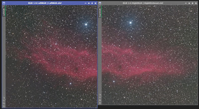
Mosaics are built from linear images, and fortunately I kept the linear version of this. The left tile will be a simple crop. The right will start as a crop and then get modified to resemble some of the differences one might see in images taken days or weeks apart. Different dithering or polar align drift might mean different cropping away of poor signal areas, so I'll change its size. Not having a rotator means it may be off by a few degrees, so I'll rotate it by three degrees. Lastly, the second tile may have a different luminance level thanks to smoke or clouds. Most of this should be removed, but I'll leave some in to see how well it gets handled. (This is done by tweaking the right tile with the Curves Transformation.) Here are the resulting left and right tiles:
 |
| Left and right "tiles" |
You can clearly see they're not the same size. The other modifications are more subtle but if not treated correctly could result in a bad merge seam, misaligned tiles, and possibly other defects.
The easiest method for merging the two panels is Star Alignment (SA). I'm going to do this using the settings suggested by Kayron Mercieca of Light Vortex Astronomy on this page. I'm going to supply SA with previews because it's so easy to do for a 2-panel mosaic. My chosen overlap is about 40%, larger than the 30% I'm using for the Veil mosaic. Executing SA gives me this:
 | |
| Rough mosaic using only Star Alignment |
Inspection of the result shows no seams, and no odd stars. It's perfectly acceptable, and confirms that (at least in this case) SA is suitable for a two-tile mosaic.
Next up is Gradient Merge Mosaic (GMM). I again used the methodology prescribed by Mercieca, first building a synthetic star field and then registering the tiles to it using SA. Then the right tile is processed by the dna Linear Fit script to insure that it matches the left script's brightness. Finally, GMM merges the two tiles.
A common problem with GMM is star pinching at the overlap edge, and my result showed severe pinching. The first fix is to adjust two parameters in GMM. Doing so helped a little, but not nearly enough. When this fails the remedy is to use Clone Stamp to remove bright stars at the offending edge. This did reduce the pinching, but not only left some and created new artifacts stemming from Clone Stamp.
After considerable efforts to deal with the pinching I came to the sense that GMM does not cope will with images having a lot of stars. This is the case for the California Nebula tiles; it will also be true for my planned Veil mosaic.
SA and GMM are the only methods described by Keller in his book "Inside PixInsight," so I was not happy. A little googling turned up another method: Photometric Mosaic (PM). PM looked very promising!
Here is a great tutorial for PM.
I followed the tutorial with one change: I used the Mosaic Join / Combination mode Overlay rather than the Blend or Average methods the presenter recommends.
The result was excellent! There are no perceptible seams or artifacts at all, even when boosted autostretching is used. Here is the result, with a quick autostretch to be nonlinear:
If this lacks the contrast of the original image it's due to using only autostretch in the processing.
I think I'm now ready for building my mosaic, and it's a day past 3rd quarter--so let the clear evenings commence!
-------------------------------------
Here's a callback to an earlier post titled "A Wristwatch for Astronomy?" The watch in question worked well in almost all regards---big, easy to read, and of course it kept time adequately. Where it failed was the luminescence. The watch hadn't been properly "charged" before wearing, so I was only able to read it using my red light. Next time I'll remember to feed it plenty of nice yummy photons!
